 |
| Pure Nokia type via Creative Review
I like the simple style of the design and the monochrome style which has a lot of varied tone within it. I think it relates to what Sarah has told me about liking bold designs with lines and intricate features to it. The use of different planes within the letterform also gives it a 3D quality.
|
 |
| 'Yes' - self initiated |
 |
| Paralympics London 2012 Campaign |
 |
| Illustrations for The Hunger Magazine |
HelloVon works a lot with digital, monochromatic illustration. His ad campaign for the London Paralympics is to me really effective because of the simplicity of design - the single image in conjunction with the powerful and punctuated message is powerful advertising. His work is both realistic and clearly manipulated, and centered around image, usually in monochrome with a plain and basic layout.
Other Type Research
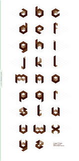
Cube 02™ Font via Font Fabric
This typeface is very mathematical and structural and comes off the page because of the cubic nature of it. It is quite technical which I like and the variation in tone gives the letters various parts to them which make them different to a standard geometric typeface. Sarah's most treasured possession is her iPhone so I am considering technology and a technological approach to type.
 |
| Mekkanika Experimental Typeface by Riccardo Sabatoni |
 |
| Sweater Letter by MaricorMaricar |
 |
| Geomas Type |
 |
| Peluda Typeface via Peluda Type
This type has a delicate nature due to the use of individual strands of hair and detail - also the layout of individual letterforms on the organic looking background draws attention to the intricacy of the design.
|
 |
| Naname-Kun |
"Naname-Kun is a geometric typeface created with oblique lines as a main texture. Its unique particularity is to be filled with diagonal hatching that varies in thickness to create different styles and weights." I like how the hatching is so incorporated into the typeface and such an intrinsic part of it's success. Otherwise it would be very simple in form and this adds another dimension to it of geometry and texture. Normally I think of typefaces such as the standard fonts on computer software as being largely two dimensional and flat - Naname-Kun is different to that.
 |
| Gemini Typeface |
 |
| Celestial Night
This is another geometrical, quite angular typeface. What I find interesting about Celestial Night is how all of the letterforms are still so legible even with missing elements to them. I like the idea of simplifying a typeface down to it's bare elements and pushing the boundaries of how much information is needed for it still to be understood as a font. This typeface is reminiscent of astrology and star maps which I am assuming is the reason for the name behind it, and display image.
Layout of complete typefaces
Typophobia by Erre Galvez
"Typophobia was born for my fun, by people's phobias, by an old book, by an abandoned house, by fear, by an ink drop and smell of paper." Although not immediately clear without a full explanation there is a clear concept behind typophobia as a font. It is very abstract in form and some of the letterforms have questionable legibility - but I think it works. In terms of presentation I think the layout on the left is really effective, utilising the typeface in a sentence but also by changing the texture of the font and having an image in the background - this puts it into a genuine graphic design context.
"ALPHA_TXT, has developed into Typeface that represents the evolution of the English language. It reflects the way that we communicate due to our yes, yes, now, now global society. ALPHA_TXT reflects this issue by abbreviating individual characters in the English alphabet. It is governed by same rules imposed as SMS messaging on a mobile telephone keypad."
This typeface has been presented in several different contexts - digitally, in a publication and in a poster format. The publication presents both individual letterforms and their development as well as the complete typeface and in context.
|


No comments:
Post a Comment