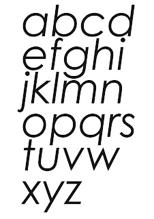
Legibility
The degree to which glyphs in text are understandable or recognisable based on appearance
Readability
The ease in which text can be read and understood. Influenced by line length, primary & secondary leading, justification, typestyle, kerning, tracking, point size etc.
Full Original 5 Typefaces
Century Gothic - regular
 |
| Century Gothic bold |
 |
| Century Gothic bold italic |
 |
| Century Gothic italic |
Edwardian Script - regular
Hobo Std Medium
Lucida Blackletter - regular
Perpetua - regular
 |
| Perpetua Bold |
 |
| Perpetua bold italic |
 |
| Perpetua italic |
Exploring Readability
 |
As a typeface Century Gothic is easily readable, because of its simple clear serif nature. It works well across all point sizes and I find even the bold italic version which can be too heavy and difficult to read in other typefaces, still easy to read in Century Gothic. Even without serifs it flows well in the sentence and would work for both body copy and headers.
 |
Edwardian Script is quite difficult to read because of its high detail & intricacy and very thing weight. Although the letters flow it is very decorative and overly-ornate which doesn't make it suitable for small point sizes or body text.
Although Hobo Std Medium is a sans serif font it is quite stylised and the inward curve of the letters and lack of below baseline descenders makes it difficult to read. It is quite condensed and has a heavy weight which squashes the letters together. Even when the kerning or tracking is changed the individual letterforms are generally quite difficult to read.
Lucida Blackletter is a typeface that only works well and is readable when in a higher point size. It would not be suitable for large chunks of small text such as in a book becauseof the blackletter nature of it which makes it quite difficult to read. The ascenders and descenders of letters are stylised and ornate and the close kerning of the letters means that readability is reduced.
Perpetua is quite an easily readable serif typeface. Although a serif font it has quite a modern feel to it because of the quite wide width of letters and the simplicity of letterforms. The regular weight is quite thin so when bold the typeface is still readable and not too heavy. The italic version looks almost script like but again because of its thin weight it flows quite well, there is a good amount of space between the letterforms without having to change the kerning or tracking. Although slightly less readable in smaller point size it would still function for body text.
After looking at all the typefaces & different fonts within them I think Century Gothic & Perpetua are the two most readable. I think the difference in the readability between the bold & regular versions of both typefaces are minimal.
Prints
 |
| Century Gothic regular 115pt |
 |
| Edwardian Script regular 181 pt |
 |
| Hobo Std Medium 123 pt |
 |
| Lucida Blackletter 125 pt |
 |
| Perpetua bold 123 pt |
Letterforms to work with in next week's session
 |
| Script - Zapfino |
 |
| Gothic - Franklin Gothic Medium |
 |
| Roman - Minion Pro |
 |
| Block - Impact |


No comments:
Post a Comment