6 Images of Type, Type & Image, Image which I like and dislike
Type


Type & Image


Image


Defining the aesthetic of what I like & dislike
Like
Clean
Simple
Legible
Memorable
Structured
Geometric
Distinctive
Powerful
Modernist
Sophisticated
Balanced
Professional
Impressive
Striking
Intricate
Crisp
Intriguing
Different
Dislike
Cheap
Tacky
Generic
Garish
Cluttered
Overpowering
Busy
Messy
Unclear
Illegible
Misplaced
Static
Boring
Unprofessional
Mediocre
Overworked
Chaotic
Underworked
Derivative
We had to choose 3 images from our original six and define them using 5 single words. We then swapped images with someone else and had 5, 10, then 20 seconds to write down words that came to mind when seeing their images for the first time. We had to decide which of the 3 images they liked and which they disliked and then regrouped for a discussion and comparison of the words and opinions we came up with.
 |
| Barney's words |
 |
| My words |


The only image we disagreed on was the Groundhog day poster. I can see how it could be perceived as boring or repetitive especially if you don't know the film it is advertising.
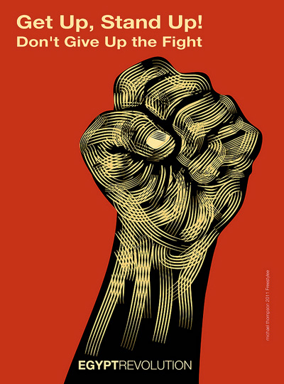
Barney's three images

Dislike - tacky, derivative, juvenile, overcrowded, unprofessional
Like - powerful, strong, simple, clear, memorable

Like - original, powerful, distinctive, striking, clever
We then had to as a pair try and come up with 10 aesthetic rules. This was really challenging and we only managed to come up with 8:
- Don't overcrowd designs
- Keep colours appropriate to the design - use as few as are needed
- Make sure all typography is legible
- Consider the relationship between type & image
- When using only black and white keep a professional look to the design
- Ensure the aesthetic & style of the design reflects the tone of voice
- Consider the concept//message behind the work
- Work in a media that relates to the content and style of a piece
My three rules which I finalised on for myself:
- The aesthetic & style should reflect the intended tone of voice
- Keep colours to a minimum
- Consider the relationship between type & image
No comments:
Post a Comment