 |
| Ray Gun magazine design by David Carson |
I find Carson's postmodernist design of Ray Gun magazine visually noisy, especially within the typographic style. There is an overbearing use of uppercase & layering which makes the information difficult to see and illegible. The image just adds to this further although is very much in the background, and I just dislike the general layout and use of space (or lack of it).
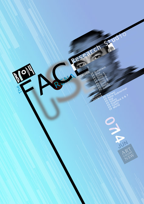 |
| The Face - designed by Neville Brody |
Graphic Design I Like


 |
| Colors Magazine - Apocalypse Issue #84 |
The cover of Colors magazine Issue #84 was a screenprinted, fold out A2 cover which has dual functionality. The simplistic, monochrome design fits in well with the very ordered design within the magazine itself, which has a particular emphasis on use of image and catalogue-style photography. There is a humour and wit in the tone of voice & magazine content which is delivered in a really stylistic design.
 |
| Bridging the Gap poster by Ross Gunter |
I discussed this later on with Andy (please see further on in post)
After the group work of organising each others' chosen pieces into categories of like and dislike we had a discussion on what our judgements of graphic design are based on. The definitive list we came up with from the session was:
- Layout
- Colour
- Context
- Visual content
- Non-visual content
- Function
- Concept
- Composition
- Legibility
- Communication
- Visual Quality
Then we came up with an ordered system for critiquing work:
D Describe (what can you see?)
I Interpret (what's it about?)
E Evaluate (how good is it?)
T Theorise (how could it be improved?)
Andy & I paired up to critique two of our images in this way.

Kleenex Ad
Describe
- Advertisement for Kleenex pocket tissues
- Simple image where the dog is textured, made out of a tissue in an origami style
- Explained by the tagline: 'best friend' refers both to the dog and in the context the tissues
- Product placed at the bottom - a physical image, brand logo & specific product name.
- Basic layout of image, tagline & product, with very basic image
Interpret
- Simple typography & image - inoffensive advertising of an unglamorous product
- Although the image is of a man quite gender neutral - 'your' instead of 'man's best friend' and also speaks directly to audience
- Purple neutral background colour & makes the white of the tissue and the product image stand out
- Square format of advert may be reference to the tissue size when folded out
- Eyes drawn diagonally downwards across advert
Evaluate
- Effective in the interaction of image and message - it has a clear, logical & accessible message which is instantly apparent and easy to understand
- Difficult product to advertise but executed with wit and originality in quite a subtle way
- Appeals to both genders
- Simple and flows well because of layout
Theorise
- No obvious improvements to be made - perhaps a little juvenile in its execution and use of colour but for the purpose I think the design style works, and it would be silly to overcomplicate//overwork it.
Bridging the Gap poster
Describe
- Poster for a nightclub in London - a night called 'Bridging the Gap'
- All information displayed: date, time & place, price, event details as well as web links at the bottom
- Use of bold geometric pattern as image; bright colours used but limited to a three colour palette
- Broken into sections of information & image, with the logo at the top, webs at the bottom and title in a larger point size
Interpret
- Simple typography is easily legible and communicate the information well
- Similarly the layout is easy to follow, organised & the breaking up into sections prevents overwhelming the audience
- The reference number at the top of the poster (BTG020) may be a reference to Peter Saville & the Factory Records ordering system
- Swiss-style grid-based design is a formulaic but effective layout
Evaluate
- The colours pop so it grabs your attention but they may be too garish
- Equally the image is so bold & quite complex that it ends up dominating the poster and takes away from the information.
- There are a lot of web addresses at the bottom of the poster - perhaps too many which surely no one would note on a poster. It actually ends up trying to include too much info
- Different aesthetic style to most nightclub poster designs, more sophisticated and retro
Theorise
- Colours should perhaps be toned down; similarly image should either be reduced to avoid overcrowding or simplified
- Perhaps remove a couple of the web addresses and strip the poster further down so the information is communicated on a more instant level.
Five Reasons Critical Analysis is useful:
- It helps you to form opinions and learn how to voice them
- You realise what elements make successful pieces of graphic design
- You learn information about designers, their work, your own work and about the different styles in which people work in
- It can act as inspiration and generate new ideas for your own work
- By evaluating & analysing other people's work especially in a group context you become better at critically analysing your own work
Five Reasons Crits are useful:
- It is good to get an outsider's perspective and a fresh point of view
- They help you organise your work & ideas and give you a mini deadline to work towards
- They make you think about what you are trying to achieve and encourage self-evaluation
- It is useful to see what point others are at within their work and gives you an idea of how much you have done//need to do
- They can give you new ideas and inspiration
What Affects my Judgement of Work:
Layout
I like design with a fairly simple and minimalistic layout, as I think it allows different parts of the design (ie text and image) to interact more effectively and not take away or distract from each other. If every element of a design is placed and organised in an effective layout I think it functions better. I hate overcrowding and think space is important, and can completely change the tone of voice and communication of a piece of design.
Visual Content
For me visual content - either image or use of type as image - is often more important than text and type. Image has to interact correctly with text and message, and I think usually has more of an initial impact when receiving a piece of design. It determines the tone of voice, style, message & function and is therefore entirely intrinsic. I usually like geometric and bold images within design, with a minimal or appropriate use of colour and illustrative but modern style.
Colour
A piece of design could be beautifully laid out, with amazing type & image and a good concept and function - but if the wrong colours are used the tone of voice completely changes. Personally I think the fewer colours within a design the better. Normally I like very subtle colours (although usually none at all and would prefer black and white) - but one of the reasons why the Bridging The Gap series of posters appeal so much to me is because of their brave but I think very effective use of bright colours. They grab the attention of the viewer without becoming garish because of the overall sophistication of the design - if the colours are loud then I think the typography and image used must be more subtle and sensitive to this.
Concept
I think a good concept is sometimes hard to find behind all types of graphic design. For me the best concepts are the ones that you realise after a brief (but not too long) analysing of the design. For example the Kleenex advert has an initial aesthetic impact, but also a secondary on a deeper conceptual level when you realise the different puns and use of product as image within the design. This really appeals to me.
Legibility
I really dislike design which is not easily legible - lack of legibility is the main issue which I have with designers such as David Carson. It makes his work less accessible which I think lessens the immediacy and impact of design. A legible piece of design is clear, and therefore communicates more effectively.


